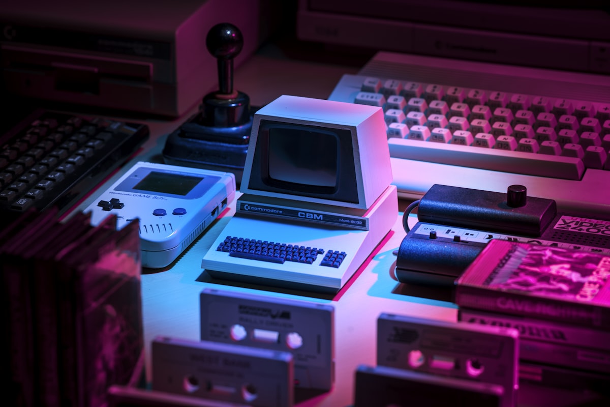
Texture is the implied surface quality of an element — rough, smooth, soft, metallic — communicated visually even though a screen has no actual physical surface for a finger to feel. In digital design, texture is always an illusion built from gradients, noise, shadow, and pattern, but that illusion is powerful enough to change how "real" or "tactile" an interface feels before a user touches anything.
Borrowing the Body's Memory of Touch
People carry a lifetime of tactile memory, and visual cues that resemble familiar physical textures, the soft give of fabric, the hard sheen of glass, the grain of wood, trigger some of that memory even through a flat screen. This is why skeuomorphic interfaces, which mimicked real-world textures directly, felt intuitively "grippable" to early smartphone users who had no other frame of reference: the visual texture stood in for a tactile expectation the interface itself could never actually fulfill.
In Product Design
Modern flat and neumorphic design use texture far more subtly than early skeuomorphism did: a soft drop shadow implying a raised, pressable surface, a faint grain or noise texture breaking up a large flat color field so it doesn't feel sterile, a subtle gradient suggesting depth on an otherwise flat button. Used sparingly, texture adds warmth and tactility without dragging an interface back toward the heavy ornamentation flat design intentionally moved away from.
- A button with no visual cue at all suggesting it's raised, pressable, or interactive, leaving users uncertain whether it responds to a tap
- A large solid-color background section that reads as flat and lifeless compared to surrounding sections with subtle texture or gradient
- Card shadows so heavy and dark they suggest a texture more suited to a physical, tactile object than a lightweight digital surface
- Decorative background patterns dense enough to compete with the actual content sitting on top of them
The common thread is calibration — texture works when it reinforces a surface's role, pressable, flat, elevated, and works against the design the moment it's applied heavily enough to become a distraction of its own.
How to Apply It
Use texture in small, purposeful doses to reinforce a specific behavior, most often "this is pressable" or "this sits above that." Favor subtle gradients, soft shadows, and light noise over anything heavy or literal, and always test texture at actual device size and brightness, since effects that look tasteful on a large calibrated monitor can disappear or turn muddy on a small, dim phone screen.
Why It Matters
Interfaces with zero textural cues can feel cold or ambiguous about what's actually interactive, while interfaces overloaded with texture feel dated or visually noisy. The right amount sits in a narrow middle ground, which is why texture is one of the principles most often gotten wrong in either direction. A fast test: ask a first-time user to point at what they think is clickable on a screen. If their guesses are wrong more often than right, texture, or its absence, is very likely part of the reason.