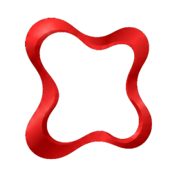
Letting the outline of an element set its tone before any content does
A
Designers Academy
1 August 2026 · 3 min read
Visual DesignPrinciples
In brief
Shape in product design refers to the outline or form of an element, like a circle or square, which communicates tone and meaning to users pre-consciously, influencing perception before any content or color is registered.
Shape is the outline or form an element takes — circle, square, rounded rectangle, custom icon silhouette — and it carries meaning well before any label or color is applied to it. A rounded button and a sharp-cornered one can contain identical text and still feel like they belong to different products, because shape itself communicates a tone before content ever does.
Shape as an Emotional Shortcut
People associate rounded shapes with softness, friendliness, and approachability, and angular shapes with precision, seriousness, or stability, an association strong enough to show up consistently across cultures and even in infants too young to have learned it from branding. This is why a children's app and a legal software product tend to land on very different corner radii without either designer necessarily articulating why: shape is doing emotional work that neither of them had to spell out explicitly.
In Product Design
Shape governs a product's corner radius, sharp for precision-oriented tools, rounded for consumer-friendly ones, the silhouette consistency of an icon set, and the recognizability of custom UI elements like toggles, chips, and badges. A consistent shape language, applied across buttons, cards, and inputs, is one of the fastest ways to make a product feel deliberately designed rather than assembled from mismatched defaults.
A product mixing sharp-cornered cards with heavily rounded buttons, sending two different tonal signals within the same screen
An icon set where some icons use rounded caps and others use sharp, mitered corners, so the set doesn't read as one coherent family
A toggle switch shaped closely enough to a checkbox that users misread its current state at a glance
Badges and chips using inconsistent corner radii across different parts of the same product, undermining the sense that they're the same type of UI element
Each of these is a small shape inconsistency, but shape is read fast and pre-consciously, which means these mismatches are felt as "something's off" well before a user could articulate the actual cause.
How to Apply It
Pick a shape language early, corner radius values, icon silhouette rules, the general roundedness or sharpness of the product, and apply it as consistently as color or type. Treat shape as a deliberate brand decision rather than a per-component afterthought, since it's one of the fastest signals a user reads for tone.
Why It Matters
Inconsistent shape use undercuts a product's tone even when every other principle is handled well, because shape is processed so quickly that mismatches register before the eye even gets to color or content. A serious financial tool with playfully rounded corners, or a children's app with sharp, clinical edges, sends a tonal signal that works against the product's actual purpose. A fast test: cover every icon and button in solid black silhouettes. If the resulting shapes don't feel consistent with each other, shape language needs a firmer rule.
Key takeaways
✓Shape communicates tone and meaning instantly, even before content or color is applied.
✓Users associate rounded shapes with friendliness and angular ones with precision across cultures.
✓Consistent shape language—like uniform corner radii or icon silhouettes—makes a product feel deliberately designed.
✓Inconsistent shapes undermine a product's tone and create a subtle sense that 'something's off' for users.
✓Treat shape as an early, deliberate brand decision, applying it as consistently as color or typography.